Noemova archa dětí

Year
'25
Client
Noemova archa dětí z.s.
Service
Visual Design, Illustrastion
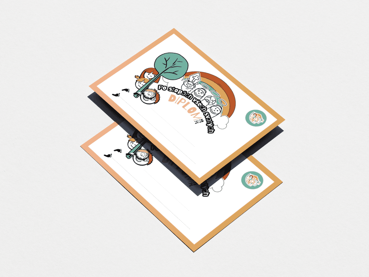
Noemova archa dětí is a project created for children, reflected in its playful color palette and friendly typography. The hand-drawn logo, built from children’s faces, expresses community, joy, and togetherness. The visual identity was further developed for a children’s camp “In the Footsteps of All Saints”, including custom T-shirt prints and diplomas, all unified within the same handcrafted style.
© Noemova archa dětí


Idea
To create a playful and approachable identity that reflects joy, togetherness, and a sense of community.
Approach
A hand-drawn visual language combined with soft colors and simple typography.
The focus was on consistency across all outputs, creating a cohesive and recognizable identity without relying on promotional materials.
Veselá
Salon Krásno