Salon Krásno

Year
'24
Client
Salon Krásno
Service
Visual Identity, Brand & Web Design
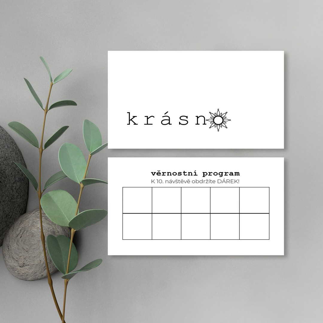
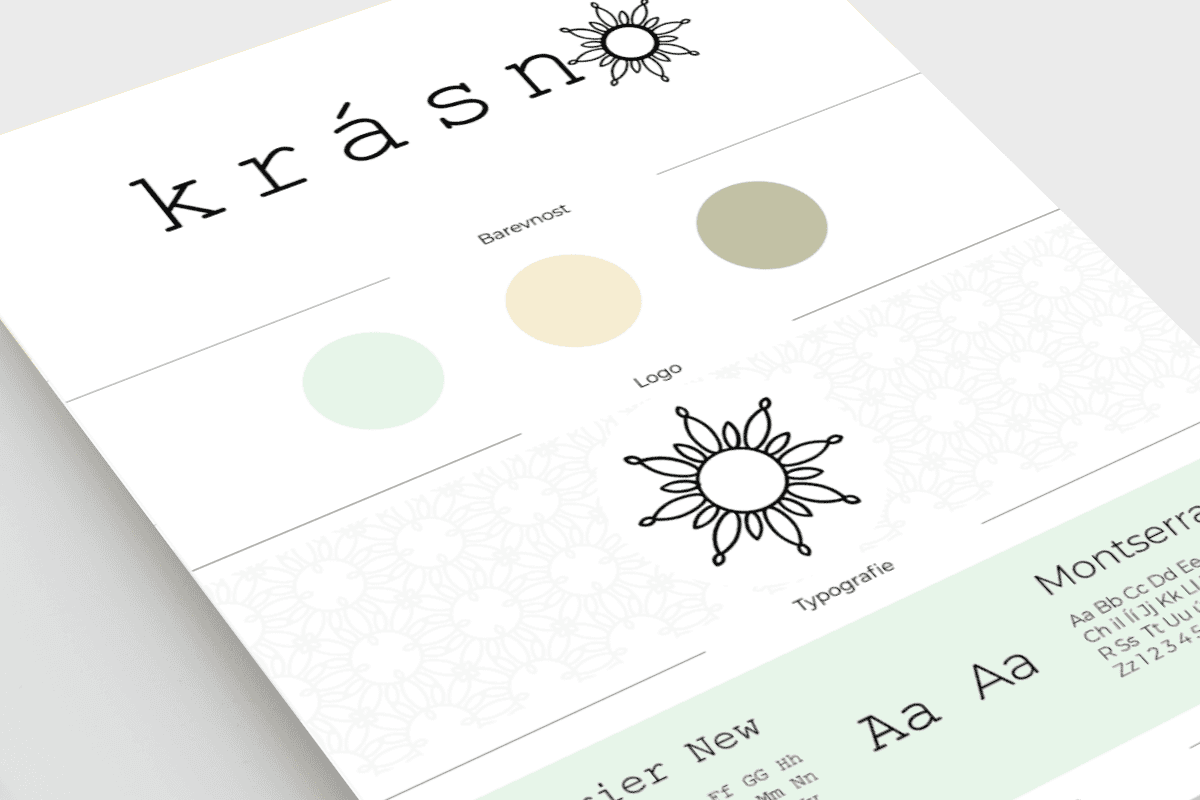
Salon Krásno is a space for calm, care, and quiet renewal. The identity combines soft pastel tones with precise typography, creating a balance between lightness and structure. The sun symbol brings warmth, energy, and a subtle personal meaning.
© Salon Krásno

Idea
A brand built around a simple feeling — “je mi krásně”. A moment of comfort, stillness, and inner balance.
Approach
Soft colors meet technical typography to create contrast and clarity. The visual system translates the brand’s calm atmosphere across all touchpoints.
Noemova archa dětí
Tanec Liberec